CometChatMessageComposer renders the message input area and sends messages to the active conversation. It supports text, media, mentions, voice notes, stickers, and AI-powered features.Where It Fits CometChatMessageComposer is an input component. Wire it with CometChatMessageHeader and CometChatMessageList to build a complete messaging layout. Kotlin (XML Views)
Jetpack Compose
< com.cometchat.uikit.kotlin.presentation.messagecomposer.ui.CometChatMessageComposer android:id = "@+id/message_composer" android:layout_width = "match_parent" android:layout_height = "wrap_content" />
val messageComposer = findViewById < CometChatMessageComposer >(R.id.message_composer) messageComposer. setUser (user)
CometChatMessageComposer ( user = user )
Quick Start Kotlin (XML Views)
Jetpack Compose
Add to your layout XML: < com.cometchat.uikit.kotlin.presentation.messagecomposer.ui.CometChatMessageComposer android:id = "@+id/composer" android:layout_width = "match_parent" android:layout_height = "wrap_content" />
Set a User or Group: override fun onCreate (savedInstanceState: Bundle ?) { super . onCreate (savedInstanceState) setContentView (R.layout.your_layout) val composer = findViewById < CometChatMessageComposer >(R.id.composer) composer. setUser (user) // or composer.setGroup(group) }
@Composable fun ComposerScreen () { CometChatMessageComposer ( user = user // or group = group ) }
Prerequisites: CometChat SDK initialized with CometChatUIKit.init(), a user logged in, and the UI Kit dependency added.
The MessageComposer manages runtime permissions. To ensure the ActivityResultLauncher is properly initialized, create the composer in the onCreate state of an activity. If using a fragment, load it in the activity’s onCreate.
Actions and Events Callback Methods Fires when the send button is tapped. Override to intercept or replace the default message-sending logic.
Kotlin (XML Views)
Jetpack Compose
messageComposer. setOnSendButtonClick { context, baseMessage -> // Custom send logic }
CometChatMessageComposer ( user = user, onSendButtonClick = { context, baseMessage -> // Custom send logic } )
onErrorFires on internal errors (network failure, auth issue, SDK exception).
Kotlin (XML Views)
Jetpack Compose
messageComposer. setOnError { context, exception -> Log. e ( "Composer" , "Error: ${ exception.message } " ) }
CometChatMessageComposer ( user = user, onError = { context, exception -> Log. e ( "Composer" , "Error: ${ exception.message } " ) } )
SDK Events The MessageComposer does not attach SDK listeners directly. Typing indicators are managed internally when disableTypingEvents is false (default).
Functionality Method (Kotlin XML) Compose Parameter Description setUser(user)user = userSet target user for 1-on-1 conversations setGroup(group)group = groupSet target group for group conversations setOnSendButtonClick { }onSendButtonClick = { }Override send button behavior setParentMessageId(id)parentMessageId = idSet parent message ID for threaded replies setTextFormatters(list)textFormatters = listCustom text formatters (mentions, etc.) setEnableRichTextFormatting(true)enableRichTextFormatting = trueEnable rich text formatting
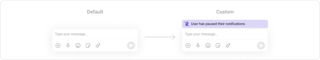
Custom View Slots Custom view above the text input area.
Kotlin (XML Views)
Jetpack Compose
val view = LayoutInflater. from (context). inflate (R.layout.custom_header_layout, null ) messageComposer. setHeaderView (view)
CometChatMessageComposer ( user = user, headerView = { Card (colors = CardDefaults. cardColors (containerColor = Color ( 0xFFEDEAFA ))) { Row (Modifier. padding ( 8 .dp), verticalAlignment = Alignment.CenterVertically) { Icon ( painterResource (R.drawable.ic_notes), "Notes" ) Spacer (Modifier. width ( 4 .dp)) Text ( "Notes" ) } } } )
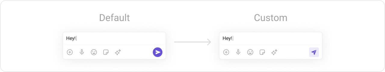
Replace the default send button.
Kotlin (XML Views)
Jetpack Compose
val imageView = ImageView ( this ) imageView. setImageResource (R.drawable.custom_send_button) imageView. setOnClickListener { Toast. makeText ( this , "Custom Send Button Clicked!" , Toast.LENGTH_SHORT). show () } messageComposer. setSendButtonView (imageView)
CometChatMessageComposer ( user = user, sendButtonView = { IconButton (onClick = { /* custom send */ }) { Icon ( painterResource (R.drawable.custom_send_button), "Send" ) } } )
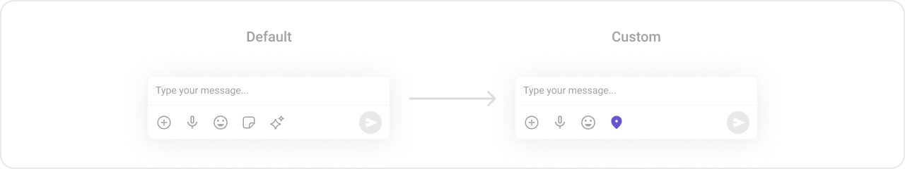
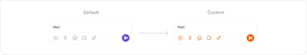
Replace the auxiliary button area (stickers, AI).
If you override the auxiliary button with setAuxiliaryButtonView(), retrieve the default auxiliary buttons via CometChatUIKit.getDataSource().getAuxiliaryOption() and include them in your custom layout to preserve sticker/AI buttons.
Kotlin (XML Views)
Jetpack Compose
val linearLayout = LinearLayout ( this ) linearLayout.orientation = LinearLayout.HORIZONTAL // Preserve default auxiliary buttons val defaultView = CometChatUIKit. getDataSource (). getAuxiliaryOption ( this , user, group, messageComposer.composerViewModel. getIdMap (), messageComposer.additionParameter ) linearLayout. addView (defaultView) // Add custom button val customButton = ImageView ( this ) customButton. setImageResource (R.drawable.save_icon) linearLayout. addView (customButton) messageComposer. setAuxiliaryButtonView (linearLayout)
CometChatMessageComposer ( user = user, auxiliaryButtonView = { Row { // Custom button alongside defaults IconButton (onClick = { /* action */ }) { Icon ( painterResource (R.drawable.save_icon), "Save" ) } } } )
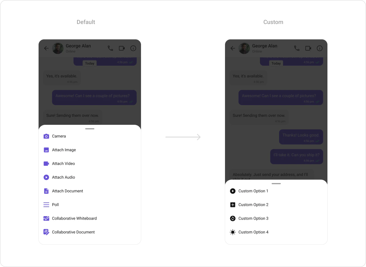
Attachment Options Replace the default attachment options.
Kotlin (XML Views)
Jetpack Compose
val actionList = ArrayList < CometChatMessageComposerAction >() val action1 = CometChatMessageComposerAction () action1.title = "Custom Option 1" action1.icon = R.drawable.ic_cp_1 action1.onClick = { Toast. makeText (context, "Custom Option 1" , Toast.LENGTH_SHORT). show () } actionList. add (action1) messageComposer. setAttachmentOptions (actionList)
CometChatMessageComposer ( user = user, attachmentOptions = listOf ( CometChatMessageComposerAction ( title = "Custom Option 1" , icon = R.drawable.ic_cp_1, onClick = { /* handle */ } ) ) )
Text Formatters (Mentions) Kotlin (XML Views)
Jetpack Compose
val mentionFormatter = CometChatMentionsFormatter (context) mentionFormatter. setMessageComposerMentionTextStyle (context, R.style.CustomMentionsStyle) val textFormatters: MutableList < CometChatTextFormatter > = ArrayList () textFormatters. add (mentionFormatter) messageComposer. setTextFormatters (textFormatters)
val mentionFormatter = CometChatMentionsFormatter (context) CometChatMessageComposer ( user = user, textFormatters = listOf (mentionFormatter) )
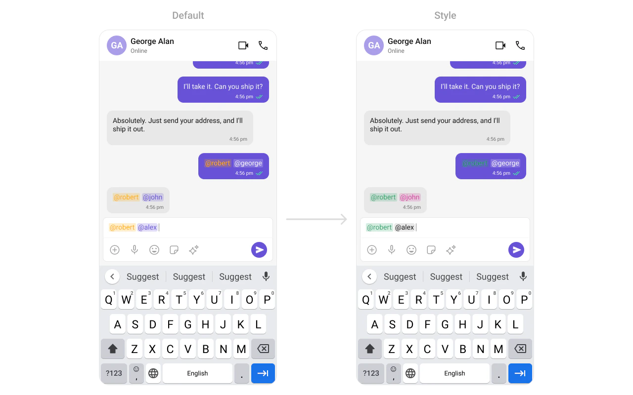
Style Kotlin (XML Views)
Jetpack Compose
Define a custom style in themes.xml: < style name = "CustomMessageComposerStyle" parent = "CometChatMessageComposerStyle" > < item name = "cometchatMessageComposerBackgroundColor" > #FEEDE1 </ item > < item name = "cometchatMessageComposerInputBackgroundColor" > #FFFFFF </ item > </ style > < style name = "AppTheme" parent = "CometChatTheme.DayNight" > < item name = "cometchatMessageComposerStyle" > @style/CustomMessageComposerStyle </ item > </ style >
CometChatMessageComposer ( user = user, style = CometChatMessageComposerStyle. default (). copy ( backgroundColor = Color ( 0xFFFEEDE1 ), inputBackgroundColor = Color.White ) )
See Component Styling for the full reference.
ViewModel val viewModel = ViewModelProvider ( this ) . get (CometChatMessageComposerViewModel:: class .java)
Kotlin (XML Views)
Jetpack Compose
messageComposer. setViewModel (viewModel)
CometChatMessageComposer ( user = user, messageComposerViewModel = viewModel )
See ViewModel & Data for state observation and custom repositories.
Next Steps
Message List Display messages in a conversation
Message Header Display user/group info in the toolbar
Message Template Customize message bubble structure
Component Styling Detailed styling reference