MessageTemplate defines and customizes both the structure and the behavior of the MessageBubble. It acts as a schema for creating message bubble components, allowing you to manage the appearance and interactions of message bubbles within your application.
When to Use This
- Customize the header, content, footer, bottom, or status info view of a message bubble
- Replace the default bubble layout with a completely custom view
- Add or modify the long-press options on a message bubble
- Create a new template for a custom message type (e.g., a contact card)
- Change how a specific message type (text, image, etc.) renders in the MessageList
Prerequisites
- CometChat Android UI Kit dependency added
CometChatUIKit.init()called and completed- A logged-in CometChat user
- Familiarity with the MessageList component
Quick Start
- Get the list of existing message templates from the data source:
- Kotlin (XML Views)
- Jetpack Compose
- Find the template for the message type you want to customize:
- Kotlin (XML Views)
- Jetpack Compose
- Customize a view on the matched template:
- Kotlin (XML Views)
- Jetpack Compose
- Apply the modified templates to the MessageList:
- Kotlin (XML Views)
- Jetpack Compose
Core Concepts
MessageBubble Structure
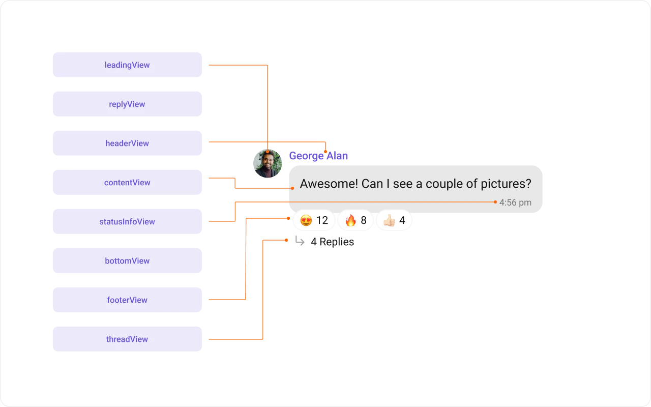
MessageBubble structure is broken down into these views:
- Leading view — Sender’s avatar. Left for incoming, right for outgoing.
- Header view — Sender’s name. Useful in group chats.
- Content view — Core message content (text, images, videos, etc.).
- Bottom view — Additional elements like link previews or “load more” buttons.
- Footer view — Timestamp and delivery/read status.
Template Properties
- Type:
setType()maps the template to aCometChatMessagetype. - Category:
setCategory()links the template with a message category.
Implementation
Header View
Customize the header area above the content view.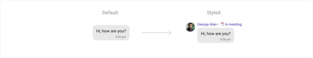
- Kotlin (XML Views)
- Jetpack Compose
Content View
Customize the main content area of the message bubble.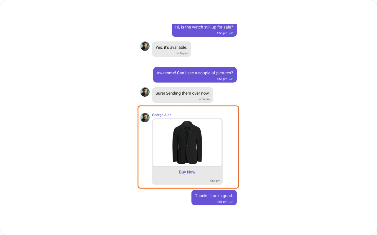
- Kotlin (XML Views)
- Jetpack Compose
Status Info View
Customize the status info area (delivery/read status indicators).
- Kotlin (XML Views)
- Jetpack Compose
Bottom View
Extend the bubble with additional elements beneath the content view.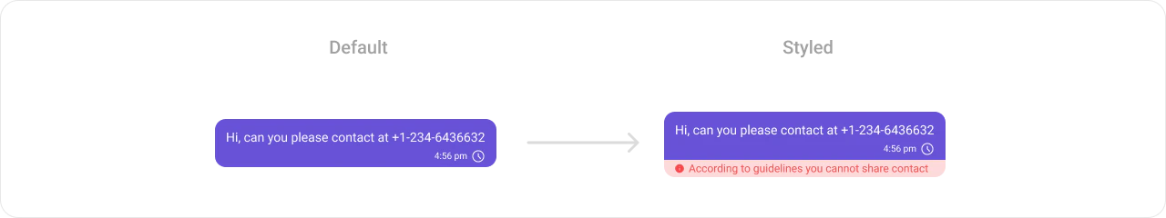
- Kotlin (XML Views)
- Jetpack Compose
Footer View
Customize the footer area (timestamp and delivery status).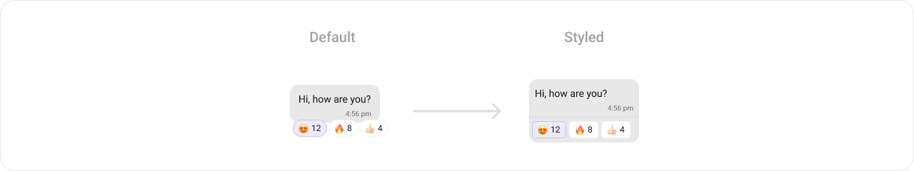
- Kotlin (XML Views)
- Jetpack Compose
Bubble View
Replace the entire message bubble with a fully custom layout.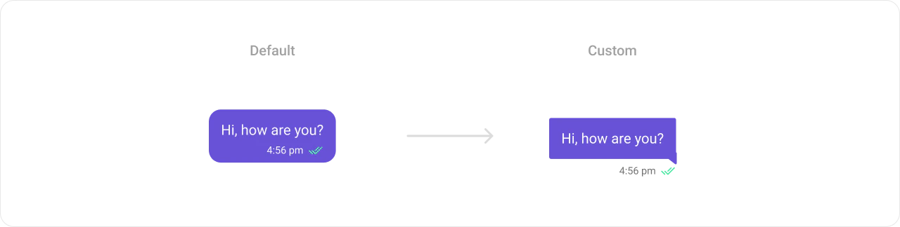
- Kotlin (XML Views)
- Jetpack Compose
Options
Customize the long-press action menu for a message type.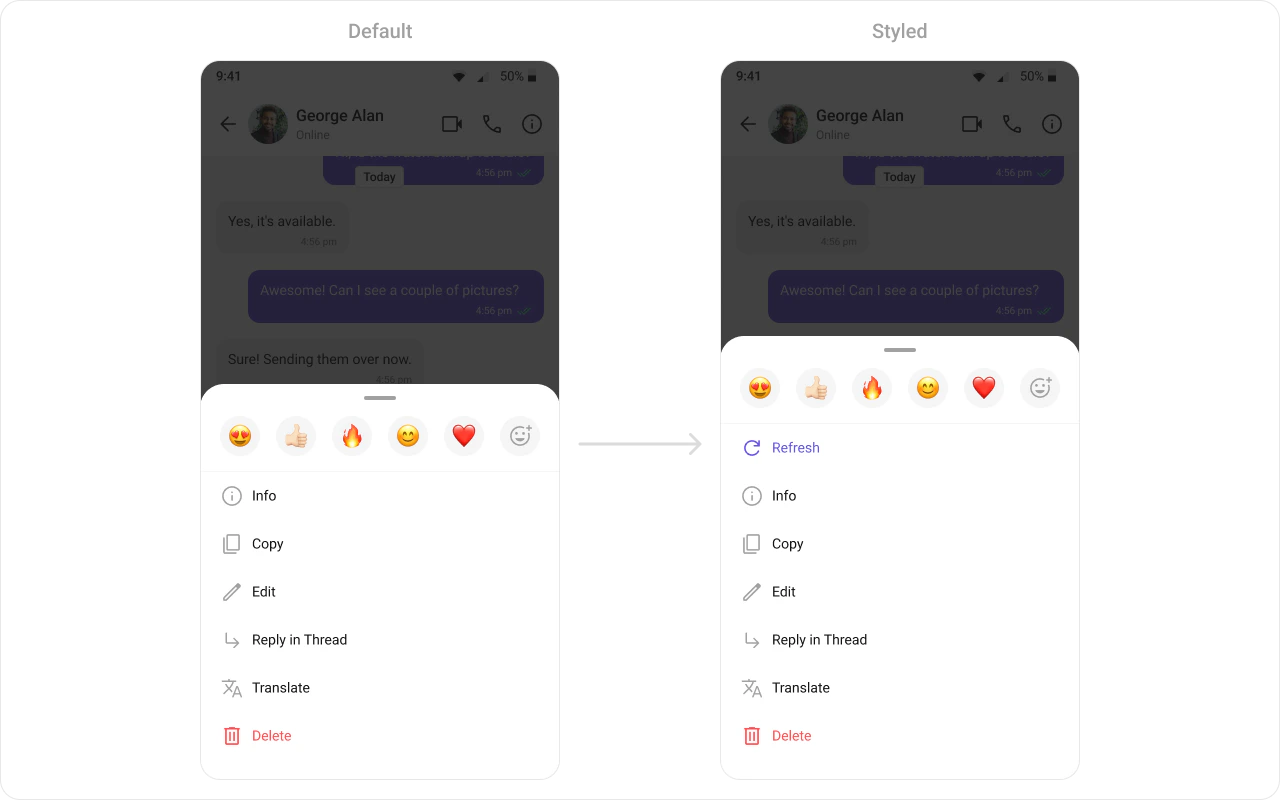
- Kotlin (XML Views)
- Jetpack Compose
Creating a New Template
Create a template for a custom message type (e.g., a contact card):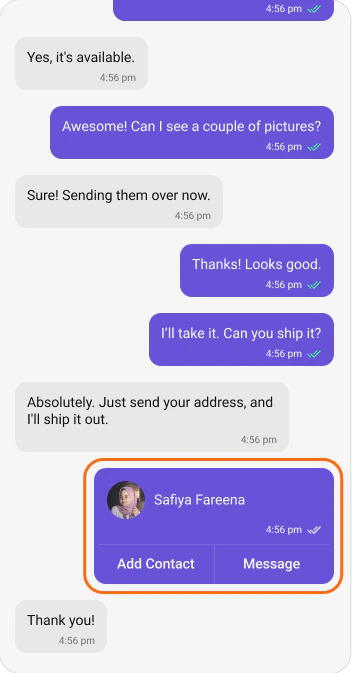
- Kotlin (XML Views)
- Jetpack Compose
Next Steps
Message List
Display messages in a conversation
Message Bubble Styling
Style individual bubble types
Component Styling
Detailed styling reference
View Slots
Replace specific UI regions