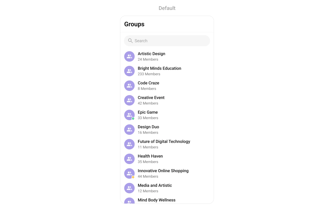
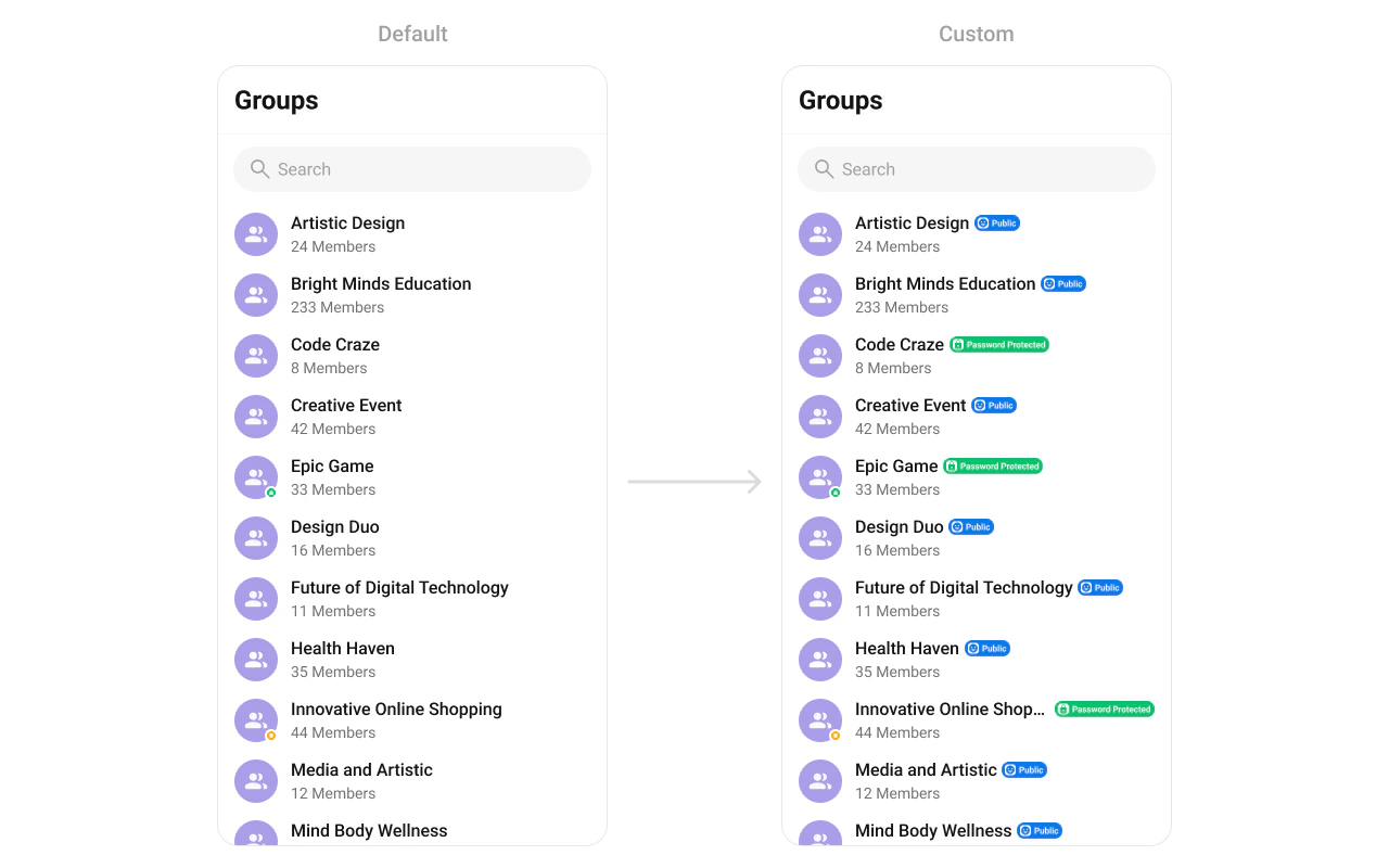
CometChatGroups renders a scrollable list of all available groups with real-time updates for membership changes, search, avatars, and group type indicators (public, private, password-protected).Where It Fits CometChatGroups is a list component. It renders all available groups and emits the selected Group via onItemClick. Wire it to CometChatMessageHeader, CometChatMessageList, and CometChatMessageComposer to build a group messaging layout. Kotlin (XML Views)
Jetpack Compose
< com.cometchat.uikit.kotlin.presentation.groups.ui.CometChatGroups android:id = "@+id/groups" android:layout_width = "match_parent" android:layout_height = "match_parent" />
val groups = findViewById < CometChatGroups >(R.id.groups) groups. setOnItemClick { group -> messageHeader. setGroup (group) messageList. setGroup (group) messageComposer. setGroup (group) }
CometChatGroups ( modifier = Modifier. fillMaxSize (), onItemClick = { group -> messageHeader. setGroup (group) messageList. setGroup (group) messageComposer. setGroup (group) } )
Quick Start Kotlin (XML Views)
Jetpack Compose
Add to your layout XML: < com.cometchat.uikit.kotlin.presentation.groups.ui.CometChatGroups android:id = "@+id/groups" android:layout_width = "match_parent" android:layout_height = "match_parent" />
Or programmatically: override fun onCreate (savedInstanceState: Bundle ?) { super . onCreate (savedInstanceState) setContentView ( CometChatGroups ( this )) }
@Composable fun GroupsScreen () { CometChatGroups ( modifier = Modifier. fillMaxSize () ) }
Prerequisites: CometChat SDK initialized with CometChatUIKit.init(), a user logged in, and the UI Kit dependency added.
Or in a Fragment:
Kotlin (XML Views)
Jetpack Compose
override fun onCreateView (inflater: LayoutInflater , container: ViewGroup ?, savedInstanceState: Bundle ?): View { return CometChatGroups ( requireContext ()) }
override fun onCreateView (inflater: LayoutInflater , container: ViewGroup ?, savedInstanceState: Bundle ?): View { return ComposeView ( requireContext ()). apply { setContent { CometChatGroups () } } }
Filtering Groups Kotlin (XML Views)
Jetpack Compose
Pass a GroupsRequest.GroupsRequestBuilder to control what loads: groups. setGroupsRequestBuilder ( GroupsRequest. GroupsRequestBuilder () . joinedOnly ( true ) . setLimit ( 20 ) )
CometChatGroups ( groupsRequestBuilder = GroupsRequest. GroupsRequestBuilder () . joinedOnly ( true ) . setLimit ( 20 ) )
Filter Recipes Recipe Builder method Joined only .joinedOnly(true)Limit per page .setLimit(10)Search by keyword .setSearchKeyWord("design")Filter by tags .setTags(listOf("vip"))With tags .withTags(true)
Pass the builder object, not the result of .build(). The component calls .build() internally. Default page size is 30 with infinite scroll.
Actions and Events Callback Methods onItemClickFires when a group row is tapped. Primary navigation hook.
Kotlin (XML Views)
Jetpack Compose
groups. setOnItemClick { group -> // Navigate to group chat screen }
CometChatGroups ( onItemClick = { group -> // Navigate to group chat screen } )
Replaces the default item-click behavior. Your custom lambda executes instead of the built-in navigation.
onItemLongClickFires when a group row is long-pressed. Use for additional actions like delete or leave.
Kotlin (XML Views)
Jetpack Compose
groups. setOnItemLongClick { group -> // Show context menu }
CometChatGroups ( onItemLongClick = { group -> // Show context menu } )
onBackPressFires when the user presses the back button in the toolbar.
Kotlin (XML Views)
Jetpack Compose
groups. setOnBackPress { finish () }
CometChatGroups ( onBackPress = { /* navigate back */ } )
onSearchClickFires when the user taps the search icon in the toolbar.
Kotlin (XML Views)
Jetpack Compose
groups. setOnSearchClick { // Open search screen }
CometChatGroups ( onSearchClick = { /* open search */ } )
onSelectionFires when groups are selected/deselected in multi-select mode.
Kotlin (XML Views)
Jetpack Compose
groups. setSelectionMode (UIKitConstants.SelectionMode.MULTIPLE) groups. setOnSelection { selectedGroups -> updateToolbar (selectedGroups.size) }
CometChatGroups ( selectionMode = UIKitConstants.SelectionMode.MULTIPLE, onSelection = { selectedGroups -> updateToolbar (selectedGroups.size) } )
onErrorFires on internal errors (network failure, auth issue, SDK exception).
Kotlin (XML Views)
Jetpack Compose
groups. setOnError { exception -> Log. e ( "Groups" , "Error: ${ exception.message } " ) }
CometChatGroups ( onError = { exception -> Log. e ( "Groups" , "Error: ${ exception.message } " ) } )
onLoadFires when the list is successfully fetched and loaded.
Kotlin (XML Views)
Jetpack Compose
groups. setOnLoad { groupList -> Log. d ( "Groups" , "Loaded ${ groupList.size } " ) }
CometChatGroups ( onLoad = { groupList -> Log. d ( "Groups" , "Loaded ${ groupList.size } " ) } )
onEmptyFires when the list is empty after loading.
Kotlin (XML Views)
Jetpack Compose
groups. setOnEmpty { Log. d ( "Groups" , "No groups found" ) }
CometChatGroups ( onEmpty = { /* no groups */ } )
SDK Events (Real-Time, Automatic) The component listens to these SDK events internally. No manual setup needed.
SDK Listener Internal behavior onGroupMemberJoinedUpdates the group list when a member joins onGroupMemberLeftUpdates the group list when a member leaves onGroupMemberKickedUpdates the group list when a member is kicked onGroupMemberBannedUpdates the group list when a member is banned onGroupMemberUnbannedUpdates the group list when a member is unbanned onGroupMemberScopeChangedUpdates the group list when a member’s scope changes onMemberAddedToGroupUpdates the group list when members are added
Functionality Method (Kotlin XML) Compose Parameter Description setBackIconVisibility(View.VISIBLE)hideBackIcon = falseToggle back button setToolbarVisibility(View.GONE)hideToolbar = trueToggle toolbar setSearchBoxVisibility(View.GONE)hideSearchBox = trueToggle search box setGroupTypeVisibility(View.GONE)hideGroupType = trueToggle group type indicator setSeparatorVisibility(View.GONE)hideSeparator = trueToggle list separators setSelectionMode(MULTIPLE)selectionMode = MULTIPLEEnable selection mode setTitle("My Groups")title = "My Groups"Custom toolbar title setSearchPlaceholderText("Find...")searchPlaceholderText = "Find..."Search placeholder
Custom View Slots Leading View Replace the avatar / left section.
Kotlin (XML Views)
Jetpack Compose
groups. setLeadingView ( object : GroupsViewHolderListener () { override fun createView (context: Context , binding: CometchatListBaseItemsBinding ): View { return ImageView (context). apply { layoutParams = ViewGroup. LayoutParams ( 48 .dp, 48 .dp) } } override fun bindView ( context: Context , createdView: View , group: Group , holder: RecyclerView .ViewHolder, groupList: List < Group >, position: Int ) { val imageView = createdView as ImageView // Load group avatar } })
CometChatGroups ( leadingView = { group -> CometChatAvatar ( imageUrl = group.icon, name = group.name ) } )
Title View Replace the name / title text.
Kotlin (XML Views)
Jetpack Compose
groups. setTitleView ( object : GroupsViewHolderListener () { override fun createView (context: Context , binding: CometchatListBaseItemsBinding ): View { return TextView (context) } override fun bindView ( context: Context , createdView: View , group: Group , holder: RecyclerView .ViewHolder, groupList: List < Group >, position: Int ) { (createdView as TextView).text = group.name ?: "" } })
CometChatGroups ( titleView = { group -> Text ( text = group.name ?: "" , style = CometChatTheme.typography.heading4Medium ) } )
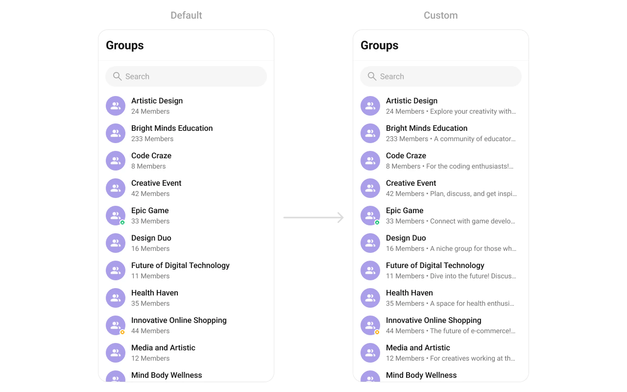
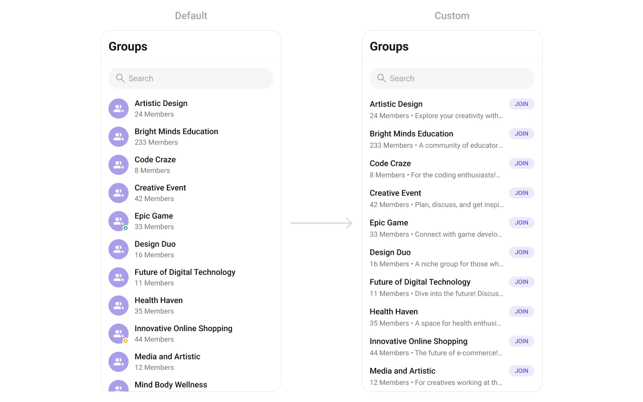
Subtitle View Replace the subtitle text below the group name.
Kotlin (XML Views)
Jetpack Compose
groups. setSubtitleView ( object : GroupsViewHolderListener () { override fun createView (context: Context , binding: CometchatListBaseItemsBinding ): View { return TextView (context). apply { maxLines = 1 ; ellipsize = TextUtils.TruncateAt.END } } override fun bindView ( context: Context , createdView: View , group: Group , holder: RecyclerView .ViewHolder, groupList: List < Group >, position: Int ) { (createdView as TextView).text = " ${ group.membersCount } members" } })
CometChatGroups ( subtitleView = { group -> Text ( text = " ${ group.membersCount } members" , maxLines = 1 , overflow = TextOverflow.Ellipsis ) } )
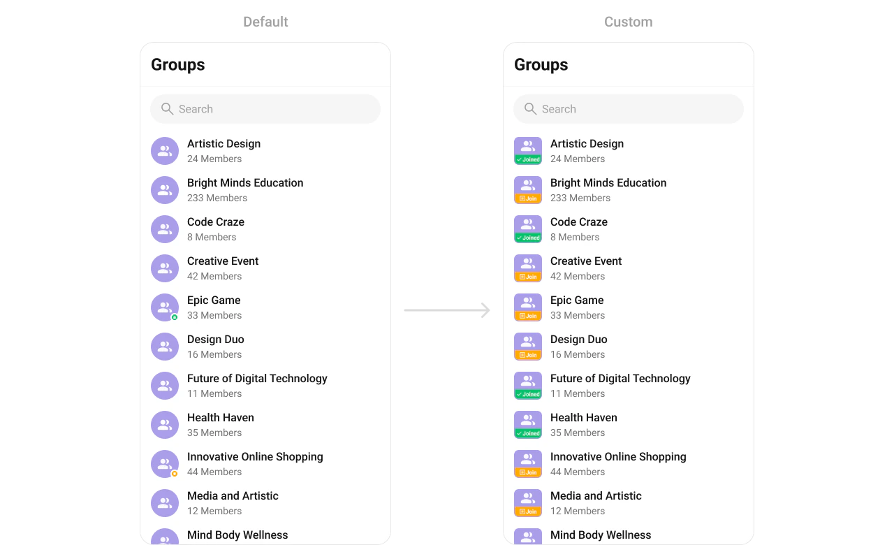
Trailing View Replace the right section of each group item.
Kotlin (XML Views)
Jetpack Compose
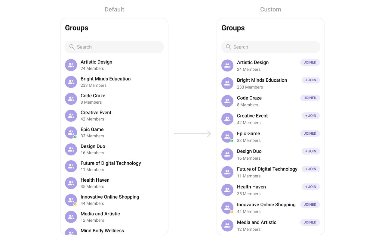
groups. setTrailingView ( object : GroupsViewHolderListener () { override fun createView (context: Context , binding: CometchatListBaseItemsBinding ): View { return TextView (context) } override fun bindView ( context: Context , createdView: View , group: Group , holder: RecyclerView .ViewHolder, groupList: List < Group >, position: Int ) { (createdView as TextView).text = if (group.isJoined) "Joined" else "Join" } })
CometChatGroups ( trailingView = { group -> Text (text = if (group.isJoined) "Joined" else "Join" ) } )
Item View Replace the entire list item row.
Kotlin (XML Views)
Jetpack Compose
groups. setItemView ( object : GroupsViewHolderListener () { override fun createView (context: Context , binding: CometchatListBaseItemsBinding ): View { return LayoutInflater. from (context). inflate (R.layout.custom_group_item, null ) } override fun bindView ( context: Context , createdView: View , group: Group , holder: RecyclerView .ViewHolder, groupList: List < Group >, position: Int ) { val avatar = createdView. findViewById < CometChatAvatar >(R.id.custom_avatar) val title = createdView. findViewById < TextView >(R.id.tvName) title.text = group.name avatar. setAvatar (group.name, group.icon) } })
CometChatGroups ( itemView = { group -> Row ( modifier = Modifier. fillMaxWidth (). padding ( 12 .dp), verticalAlignment = Alignment.CenterVertically ) { CometChatAvatar (imageUrl = group.icon, name = group.name) Spacer (Modifier. width ( 12 .dp)) Column { Text (group.name ?: "" , style = CometChatTheme.typography.heading4Medium) Text ( " ${ group.membersCount } members" , style = CometChatTheme.typography.body3Regular) } } } )
State Views Kotlin (XML Views)
Jetpack Compose
groups. setEmptyView (R.layout.custom_empty_view) groups. setErrorView (R.layout.custom_error_view) groups. setLoadingView (R.layout.custom_loading_view)
CometChatGroups ( emptyView = { Text ( "No groups found" ) }, errorView = { onRetry -> Button (onClick = onRetry) { Text ( "Retry" ) } }, loadingView = { CircularProgressIndicator () } )
Kotlin (XML Views)
Jetpack Compose
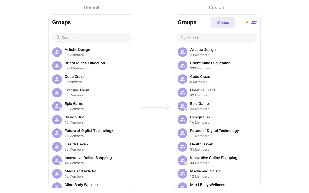
groups. setOverflowMenu ( ImageButton (context). apply { setImageResource (R.drawable.ic_create_group) setOnClickListener { /* create group */ } })
CometChatGroups ( overflowMenu = { IconButton (onClick = { /* create group */ }) { Icon ( painterResource (R.drawable.ic_create_group), "Create Group" ) } } )
Kotlin (XML Views)
Jetpack Compose
// Replace all options groups. setOptions { context, group -> listOf ( CometChatPopupMenu. MenuItem (id = "leave" , name = "Leave" , onClick = { /* ... */ }), CometChatPopupMenu. MenuItem (id = "delete" , name = "Delete" , onClick = { /* ... */ }) ) } // Append to defaults groups. setAddOptions { context, group -> listOf ( CometChatPopupMenu. MenuItem (id = "pin" , name = "Pin" , onClick = { /* ... */ }) ) }
CometChatGroups ( options = { context, group -> listOf ( MenuItem (id = "leave" , name = "Leave" , onClick = { /* ... */ }), MenuItem (id = "delete" , name = "Delete" , onClick = { /* ... */ }) ) }, addOptions = { context, group -> listOf ( MenuItem (id = "pin" , name = "Pin" , onClick = { /* ... */ })) } )
Common Patterns Minimal list — hide all chrome Kotlin (XML Views)
Jetpack Compose
groups. setToolbarVisibility (View.GONE) groups. setSearchBoxVisibility (View.GONE) groups. setGroupTypeVisibility (View.GONE)
CometChatGroups ( hideToolbar = true , hideSearchBox = true , hideGroupType = true )
Joined groups only Kotlin (XML Views)
Jetpack Compose
groups. setGroupsRequestBuilder ( GroupsRequest. GroupsRequestBuilder () . joinedOnly ( true ) )
CometChatGroups ( groupsRequestBuilder = GroupsRequest. GroupsRequestBuilder () . joinedOnly ( true ) )
Tagged groups Kotlin (XML Views)
Jetpack Compose
groups. setGroupsRequestBuilder ( GroupsRequest. GroupsRequestBuilder () . setTags ( listOf ( "support" )) . withTags ( true ) )
CometChatGroups ( groupsRequestBuilder = GroupsRequest. GroupsRequestBuilder () . setTags ( listOf ( "support" )) . withTags ( true ) )
Advanced Methods Programmatic Selection Kotlin (XML Views)
Jetpack Compose
// Enable selection groups. setSelectionMode (UIKitConstants.SelectionMode.MULTIPLE) // Select a group groups. selectGroup (group, UIKitConstants.SelectionMode.MULTIPLE) // Get selected val selected = groups. getSelectedGroups () // Clear groups. clearSelection ()
Selection is managed via the selectionMode and onSelection parameters. The component handles selection state internally.
ViewModel Access val factory = CometChatGroupsViewModelFactory () val viewModel = ViewModelProvider ( this , factory) . get (CometChatGroupsViewModel:: class .java)
Kotlin (XML Views)
Jetpack Compose
groups. setViewModel (viewModel)
CometChatGroups ( groupsViewModel = viewModel )
See ViewModel & Data for ListOperations, state observation, and custom repositories.
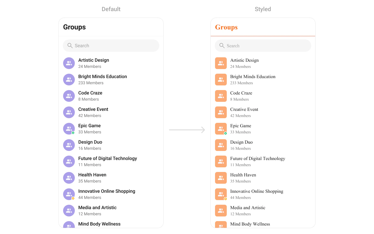
Style Kotlin (XML Views)
Jetpack Compose
Define a custom style in themes.xml: < style name = "CustomGroupsAvatarStyle" parent = "CometChatAvatarStyle" > < item name = "cometchatAvatarStrokeRadius" > 8dp </ item > < item name = "cometchatAvatarBackgroundColor" > #FBAA75 </ item > </ style > < style name = "CustomGroupsStyle" parent = "CometChatGroupsStyle" > < item name = "cometchatGroupsAvatarStyle" > @style/CustomGroupsAvatarStyle </ item > < item name = "cometchatGroupsSeparatorColor" > #F76808 </ item > < item name = "cometchatGroupsTitleTextColor" > #F76808 </ item > </ style > < style name = "AppTheme" parent = "CometChatTheme.DayNight" > < item name = "cometchatGroupsStyle" > @style/CustomGroupsStyle </ item > </ style >
CometChatGroups ( style = CometChatGroupsStyle. default (). copy ( backgroundColor = Color ( 0xFFF5F5F5 ), titleTextColor = Color ( 0xFF141414 ), itemStyle = CometChatGroupsItemStyle. default (). copy ( backgroundColor = Color.White, titleTextColor = Color ( 0xFF141414 ), subtitleTextColor = Color ( 0xFF727272 ), avatarStyle = CometChatAvatarStyle. default (). copy (cornerRadius = 12 .dp), statusIndicatorStyle = CometChatStatusIndicatorStyle. default (). copy () ) ) )
Style Properties Property Description backgroundColorList background color titleTextColorToolbar title color searchBoxStyleSearch box appearance itemStyle.backgroundColorRow background itemStyle.selectedBackgroundColorSelected row background itemStyle.titleTextColorGroup name color itemStyle.subtitleTextColorSubtitle text color itemStyle.separatorColorRow separator color itemStyle.avatarStyleAvatar appearance itemStyle.statusIndicatorStyleGroup type indicator
See Component Styling for the full reference.
Next Steps
Group Members View and manage group members
Conversations Browse recent conversations
Component Styling Detailed styling reference with screenshots
ViewModel & Data Custom ViewModels, repositories, and ListOperations